TEAM NL
Brand Identity
National Olympic Committee (NOC*NSF)
The NOC*NSF - Netherlands National Olympic Committee tasked ingredient™ with designing a unique identity that unified the individual Dutch sports federations & governing bodies under a single Olympic Team NL brand, for all European & World championships, Olympic & Paralympic Games.
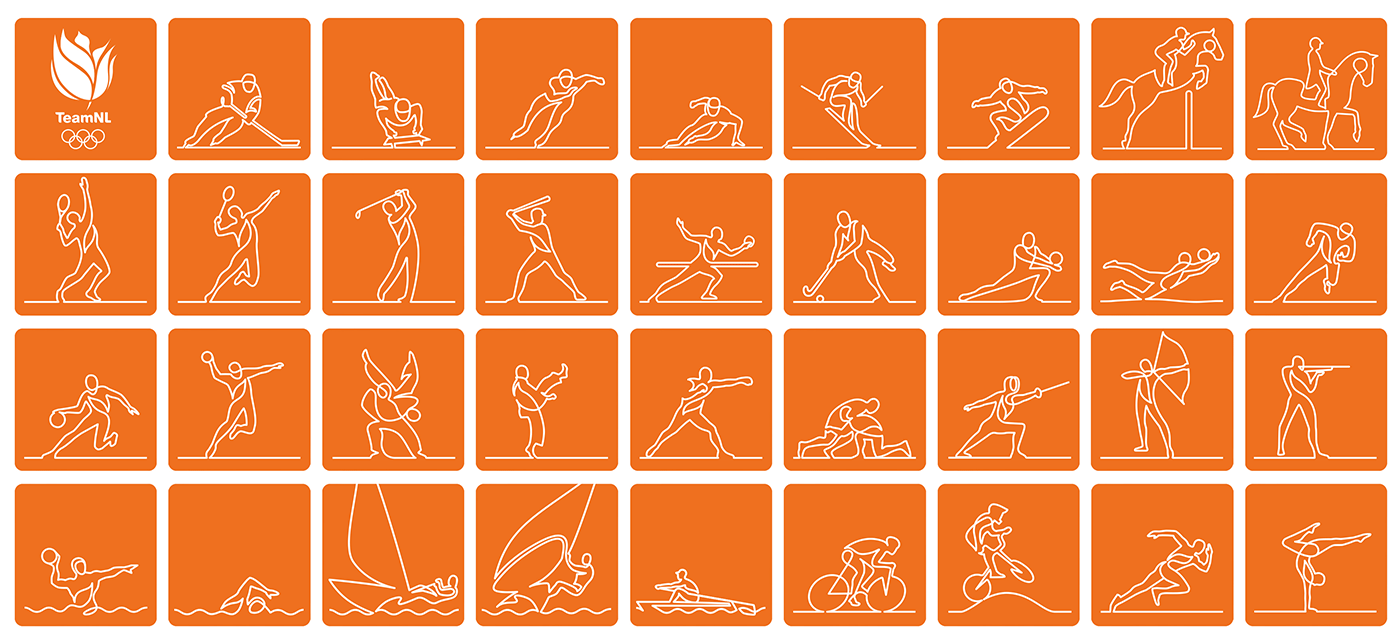
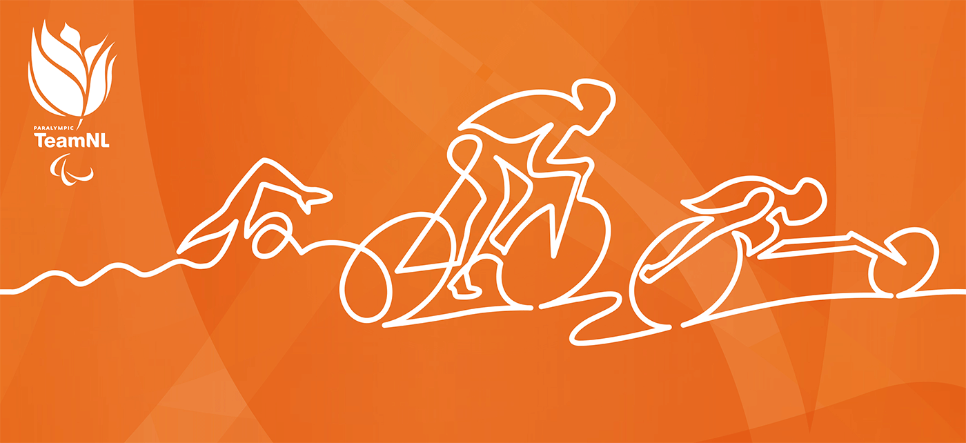
The inspiration for the new TeamNL visual identity were the graphic ‘marker lines’ that are found in most sports. These lines determine where you run, how you score, and where you finish. We created a concept that used a white unbroken graphic line, that could be manipulated to create icons or animations for each sporting discipline.
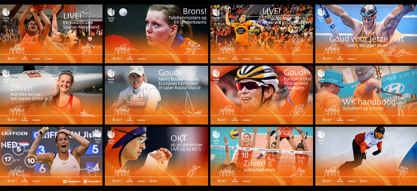
Initially, a unique series of ‘Sporticons’ were designed for each federation/sport and a separate series of fan icons. The idea connected the fans with all Team NL sports, and therefore brought to life the essence of the Brand. Every Team NL sporticon was designed after extensive guidance and feedback from each NOC sports federation. In all cases the sporticon was designed using a single unbroken white line, that incorporated an element from the Team NL logo.